Here’s a guide to help you understand how to create a visually appealing, easy-to-use, and professional website that effectively communicates your business’s purpose and offerings.
1. Use white or open space effectively to create a clean and organized design
White space, also known as negative space, is the empty space around elements on your website, like text and images. It’s essential for creating a clean, organized, and easy-to-read design.
An example of this would be having adequate margins between paragraphs, images, and other content. So, instead of cramming everything together, use white space to give your content room to breathe. This makes it easier for users to scan and process the information on your site.
Remember that white or open negative space doesn’t have to be white; it can be any background color that contrasts well with your text and images. By using white space effectively, you can guide your users’ attention to the most important elements on your page.
2. Use visual hierarchy to guide the user’s attention to important elements
Visual hierarchy is the arrangement of elements on a web page in a way that emphasizes their importance. This can be done using size, color, contrast, and typography.
For example, you might use a larger font size for your main heading and smaller font sizes for subheadings.
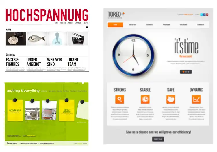
Here’s an example below in the blue box. You see the big things, first, and the middle things next and the small things last.
Here’s an example of visual heirarchy :
Learn All About Web Design On This Page
Helpful tips and tricks for non-designers and business owner
This article will really help you learn what you need to know as you work with a web designer before you launch your website.
This helps users quickly understand the structure of your content and where to find the information they’re looking for.
Another way to create visual hierarchy is by using bold ( tag) or italic text to emphasize important points within paragraphs. By making certain words or phrases stand out, you can guide the user’s attention and help them quickly grasp your message.
3. Use a grid system to ensure a consistent layout and organization of content
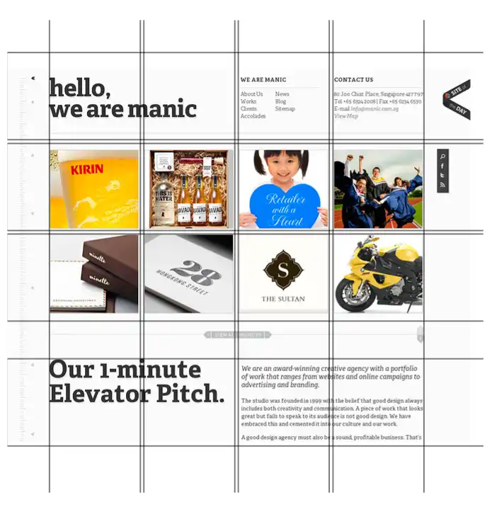
A grid system is a set of guidelines for organizing your website’s content into columns and rows, which helps create a consistent, professional-looking layout.
Grid systems can be as simple or as complex as you’d like, but the key is to maintain a consistent structure throughout your site.
An example of this would be using a 12-column grid, which allows you to divide your content into even sections for easy readability and organization.
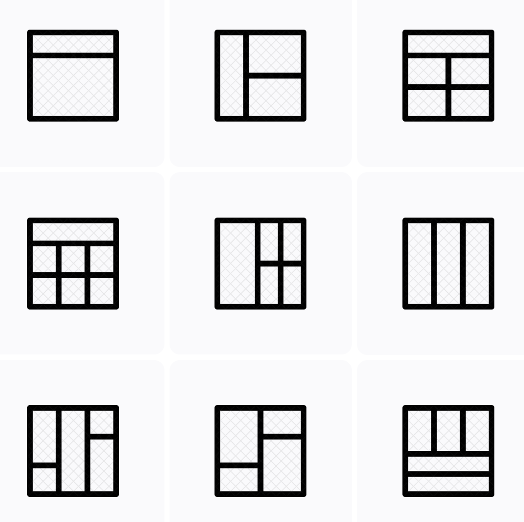
Here are some grid-based layouts:
By using a grid system, you ensure that elements on your site are aligned, and it becomes easier to create a responsive design that looks great on all devices. If you have a grid in place, it will make your site look more polished and well-organized, which is crucial for making a great first impression on potential customers.
4. Your page layout should be balanced, and not overly “busy” with elements
A balanced page layout is one that has an equal distribution of visual “weight” on both the left and right sides of the page. This can be achieved by considering the size, color, and position of elements on your site. An example of this would be placing a large image on the left side of the page and balancing it with equally sized text on the right side.
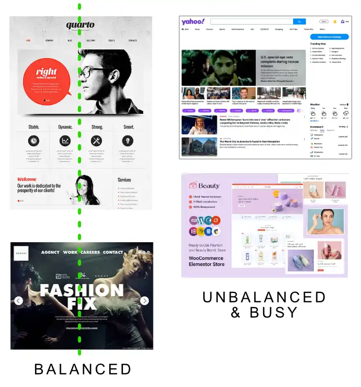
A balanced layout is visually pleasing and easier to navigate – and it’s what users have come to expect online from professional companies they see every day.
Sites that are overly busy visually are hard for the user because they don’t know where to look, or what to consider important. Less is often more.
Balanced and unbusy layouts help guide the user’s eye through your content in a natural, organized way, making it more likely they’ll engage with your site and understand your message.
5. Use a clear and concise main heading, and subheading copy to communicate your message effectively.
A user should be able to intuitively understand what you offer in 1-2 seconds
Your main heading and subheadings are crucial for quickly conveying your message to users. They should be clear, concise, and to the point, allowing users to understand your offerings within just a few seconds.
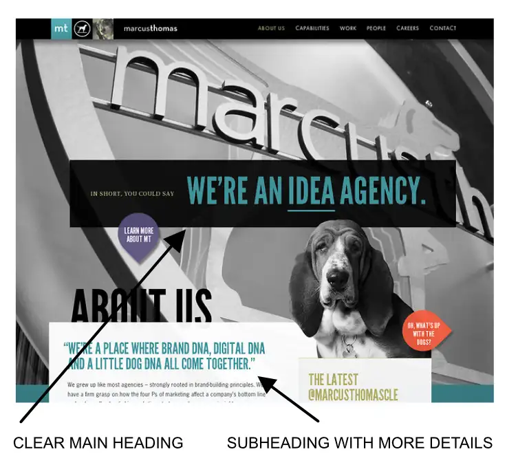
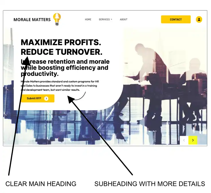 For example, having a main heading like “Affordable Web Design Services” and a subheading like “Customized Solutions for Your Business Needs.” These headings provide users with a clear idea of what you do and how you can help them.
By having a strong and easily understood main heading and subheadings, you help users quickly grasp the purpose of your site, increasing the chances they will engage with your content and become potential customers.
6. Your logo should be clean, easy to read, limited colors, and professional looking
Your logo is a visual representation of your brand and often the first thing users see when they visit your website. A clean, easy-to-read logo with limited colors and a professional look is essential for creating a positive first impression.

A logo with a simple icon or stylized text and a color palette of two to three complementary colors will be easier to read, and more clean and professional looking to your user.
A well-designed logo not only looks appealing but also helps build trust and credibility, as it demonstrates that your business takes its image and professionalism seriously. Keep in mind that your logo should also be easily recognizable and scalable, so it looks good on different devices and screen sizes.
7. Minimize text. Remember: people scan. They don’t read unless they have to, or have high interest.
Paragraphs on your homepage should be very short or non-existent. The longer paragraphs are for inner pages, or lower down on your homepage normally
When users visit your website, they typically scan the content rather than reading every word. To cater to this behavior, keep paragraphs on your homepage short and concise. An example of this would be using bullet points or short sentences to convey key information quickly and efficiently.
Longer paragraphs should be reserved for inner pages or further down your homepage, where users are more likely to be interested in reading detailed information.
By structuring your content this way, you make it easier for users to find and process the information they need, improving their overall experience on your site.
8. Use effective calls to action.
Tell your visitors what you want them to do, whether it’s to sign up for your newsletter, contact you, or make a purchase
Calls to action (CTAs) are prompts that encourage users to take a specific action on your website, such as signing up for a newsletter, contacting you, or making a purchase.
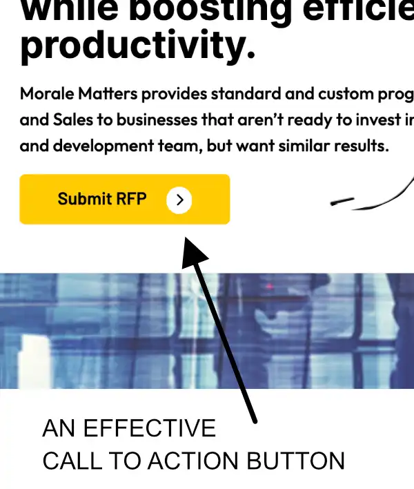
Effective CTAs should be clear, concise, and prominently placed on your site. For example, a bold “Sign Up Now” button placed near the top of your homepage or a “Contact Us” link in your site’s navigation menu.
By providing users with clear guidance on what action you’d like them to take, you increase the chances they will engage with your site and ultimately convert into customers or clients.
9. Get feedback from others.
Ask them a few questions, such as “What do you think this business does, exactly?” and so on – be sure not to lead them, and see how well they understand what your business does
Getting feedback from others is an invaluable way to assess the effectiveness of your website’s design and messaging.
Show your website to friends, family, or colleagues and ask open-ended questions to gauge their understanding of your business.
You could ask questions like:
- What do you think this business does, exactly?
- Is there anything special that this business is offering?
- Show me how you could purchase a product on this website
- Etc.
This feedback can help you identify areas where your site’s messaging may not be clear or where the design could be improved.
By addressing these issues, you’ll create a more effective and user-friendly website that better communicates your business’s purpose and offerings to potential customers.
10. Use clear and concise copy to communicate your message effectively
When writing content for your website, it’s important to use clear and concise language that gets your message across quickly and efficiently.
This means avoiding jargon, buzzwords, and overly complex sentences.
For example you might choose to write “We provide top-quality web design services at affordable prices” instead of “We leverage cutting-edge technology to architect scalable, robust web solutions at competitive price points.”
By using straightforward language, you make it easier for users to understand your offerings and see the value in your products or services, increasing the likelihood they’ll become customers.
11. Limit your color palette to create a cohesive and harmonious design
Using a limited color palette is essential for creating a visually appealing and cohesive design.
A good rule of thumb is to choose two to three primary colors that complement each other and use them consistently throughout your site.
An example of this would be selecting a primary color for your logo and headings, a secondary color for buttons and links, and a neutral color for backgrounds and text.


A well-chosen color palette not only makes your site look more polished and professional, but it also helps reinforce your brand identity and create a memorable user experience.
12. Use no more than 3 font typefaces to create a clean and consistent typography
When selecting fonts for your website, it’s important not to use too many different typefaces, as this can make your site appear cluttered and disorganized.
Stick to a maximum of three fonts: one for headings, one for subheadings, and one for body text. An example of this would be using a bold sans-serif font for headings, a lighter sans-serif font for subheadings, and a simple serif font for body text.
By limiting your font choices, you create a clean and consistent typography that’s easy to read and contributes to a polished, professional-looking design.
13. Ensure ample breathing room so that page elements aren’t cramped
When designing your website, make sure to leave enough space between elements, such as text, images, and buttons.
This “breathing room” prevents your site from feeling cluttered and overwhelming and makes it easier for users to navigate and process the information on your site.
A good practice would be using ample margins and padding around text blocks, images, and other content, as well as leaving space between lines of text (line-height).
By providing enough breathing room, you create a more pleasant user experience, which can lead to increased engagement and better conversion rates.
14. Make sure your site is responsive and accessible on all devices
Nowadays, people access websites on a variety of devices, from desktop computers to smartphones and tablets.
It’s crucial that your site is responsive, meaning it adapts to different screen sizes and resolutions to provide an optimal user experience. Talk to your developer about using flexible layouts and images that scale and reposition themselves based on the user’s device.
Remember that roughly 60% of all website traffic comes from users on mobile phones – so the mobile users are probably your largest audience
Additionally, ensure your site is accessible to all users, including those with disabilities, by following web accessibility guidelines such as providing alternative text for images and using proper heading structure.
By creating a responsive and accessible site, you ensure that everyone can access and enjoy your content, which can lead to a broader audience and increased conversions.
15. Logo in your header should be a clickable link to take the user back to your homepage
Having a clickable logo in your header that leads users back to your homepage is a common web design practice and a helpful navigation feature. An example of this would be placing your logo at the top left or center of your site’s header, and linking it to your homepage. This provides users with a quick and easy way to return to your main page, no matter where they are on your site.
By incorporating this user-friendly feature, you improve your site’s navigation and overall user experience, making it more likely that visitors will spend more time exploring your content and engaging with your business.
16. Ensure your site is search engine optimized to improve visibility and traffic
Search engine optimization (SEO) is the process of improving your website’s visibility in search engine results, which can lead to increased traffic and potential customers. Basic SEO practices include using relevant keywords in your content, proper heading structure and descriptive meta tags for your pages.
By optimizing your site for search engines, you increase the likelihood that potential customers will find your business when searching for products or services like yours, ultimately leading to more conversions and business growth.
17. Ensure your site is secure and follows best practices for data privacy
Website security and data privacy are essential for protecting your business and your users’ information.
Ensure your site is secure by using SSL certificates (HTTPS) to encrypt data transmitted between your site and your users.
You can tell when a website is using SSL when you see the little PADLOCK up in the URL bar, like this:
This is especially important if your site handles sensitive information, such as personal data or payment details.
Additionally, follow data privacy best practices, such as having a clear privacy policy and being transparent about how you collect and use user data. By prioritizing security and data privacy, you not only protect your business from potential threats but also build trust with your users, which can result in increased customer loyalty and engagement.
Summary: Your site needs to look professional to earn the trust of your users
In conclusion, creating a professional-looking website is essential for earning the trust of your users and encouraging them to engage with your business. By following these web design tips, you can create a site that not only looks polished but also provides a positive user experience.
Here’s the TLDR of all the considerations:
- Use white space effectively to create a clean and organized design.
- Employ visual hierarchy and a grid system for a consistent layout.
- Balance your page layout and use clear headings and subheadings.
- Create a clean and easy-to-read logo with limited colors.
- Keep homepage paragraphs short and save longer content for inner pages.
- Use effective calls to action to guide user behavior.
- Gather feedback from others to ensure clarity and understanding.
- Write clear and concise copy, and limit your color palette and font choices.
- Give page elements ample breathing room for an uncluttered look.
- Make your site responsive and accessible on all devices.
- Include a clickable logo in your header for easy navigation.
- Optimize your site for search engines and prioritize security and data privacy.
By implementing these tips, you’ll be ahead of the game with your customer and your website.
This will help you build trust with your users, increase engagement, and ultimately grow your business.