Important rules for business owners for effective professional looking web design
Your website is the “face” to the world for your business…
…it’s often the first thing people will do to check you out and decide if they think you’re legit and trustworthy and you know what you’re doing.
Potential customers will decide whether they trust your company enough to stay and consider becoming a customer.
Without gaining this initial level of trust, you’re kinda of sunk. They will go look somewhere else if they are not attracted to your visual presence.
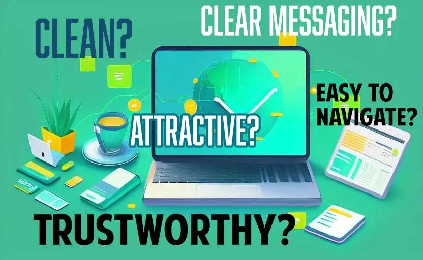
Above all – your website needs to be:
- Clean and orderly, well organized, well designed. This builds TRUST with your users. If your site feels like entering a cluttered garage, your users will never do business with you. It needs to feel like you’re entering a beautiful clean home on a magazine cover.
- Uncluttered, free of spelling errors
- Communicate your most important marketing messages clearly
- It needs to make the user feel that they can TRUST your company to be honest, dependable, and expert at whatever you do
- You will almost certainly need a designer to help you, at least a little. People without reasonable design experience can’t see the things that designers see, which add up toward making your website look professional and trustworthy.If you are a designer or have a great eye for graphic composition, you might not need the designer.
But 90% of people will need at least some help in this area. To save money, if you feel pretty good about your design sense, you can take a crack at doing the site on your own, and then pay a designer to clean it up for you and polish it. That’s an option.
See Fiverr.com or Upwork.com for help with this. There are many design considerations the average person has no idea about that go into making a clean, professional, well-organized, concise, clear, understandable, trustworthy looking website.
Fonts, font sizes, boldness, letter spacing, white space usage, color usage, composition, information hierarchy, empty space, gutter space, messaging and much more.. So bottom line is:
Find a person you know to be a GOOD designer (there are lots of terrible designers out there who think they’re good, so beware) and get some help.
- Strongly consider using Wix.com or Squarespace.com as a platform to build your site because they are fairly cheap, they have great clean professional looking templates, they are easy to use and easy to end up with a sharp looking, clean, well designed website. Paying someone to do it all custom is the old way, unless you’re creating an application or really particular design needs. WordPress is good too… but it’s more complicated…For ease of use, and to make it easier for you to be able to edit your own site, and add blog posts and pages as needed, Wix/Squarespace are easier.
Important note: you can’t do a lot of very custom stuff with Wix/Squarespace. So if you are planning to build an app really, and have users with accounts and ability to do things other than read your content, you may need a custom built site. - You’ll need to do some work in order to drive traffic to your website. It won’t just start happening organically. Learn all about SEO (Search Engine Optimization) from YouTube and what best practices are. Look at SEMRush.com too.Consider running Facebook/Instagram ads or Google ads… BUT learn about best practices FIRST… and read our post about how to not waste all your money on ads.It’s too easy to spend a lot of money, waste a lot I should say, if you don’t know what you’re doing. The internet is FULL of information about how to run ads effectively.
Make a plan for what you want and need on your website:
Look at competitors websites and notice what they are doing well. You’ll want to include these things in your website.
Get a list of 4 or 5 great looking websites that you can show to your designer so they know what you want.
Write down all the pages you think you need and write some copy (text) that you want to be displayed on the pages. If you can do some of the work yourself, the designer won’t need to charge you as much as if they needed to pull it all out of you, and figure it out. Any details as far as text, words, images, colors, ideas, photos, look and feel, other sites you like – all this is helpful to your designer.
Here are some ways to find a designer to make it look great:
These are the top places most people go to locate a good web designer:
- Upwork – Upwork is a popular freelance marketplace that connects clients with a wide range of professionals, including web designers, offering flexible hiring options like hourly rates or fixed-price projects.
- Freelancer – Freelancer is a global platform where businesses can post projects and receive bids from a large pool of website designers, enabling clients to find the best fit based on their budget and requirements.
- Fiverr – Fiverr offers an extensive list of website design services at different price points, making it an excellent choice for clients with varying budgets and project scopes.
- 99designs – 99designs is a design-focused platform where clients can run design contests, allowing multiple designers to submit their work, and then choose the best design for their website.
- Toptal – Toptal is an exclusive network of top-tier professionals that rigorously vets its website designers, ensuring clients access to the highest-quality talent for their projects.
- Behance – Behance is an online portfolio platform where clients can browse through designers’ work and directly contact them for their projects, making it a great choice for clients seeking inspiration and a more personal connection with designers.
Make sure your key value proposition is immediately understood:
Do not make the customer work to figure out what you do and how you do it. Tell them straight up why you can improve their lives. Let them know what’s in it for them.
Make it easy to understand, within 3 seconds, why they should continue to look at your website and consider your business as their solution.
Remember they want to know how their lives will be AFTER they have your product. They don’t want to read a list of what your product features are.
Organize your marketing message clearly and decide on it’s hierarchy – this will maximize the effectiveness of your website:
No doubt you want to tell your users a lot of things about why your product/service is so awesome… But you’ll want to make a list of all your most important marketing messages you want to communicate, and then PRIORITIZE that list from top to bottom.
For example, if there was only ONE thing you could communicate to a user, what would it be? That should be item #1 on your priority list, and so on, down to the less important points.
After you have that prioritized list, and you’ve triple checked that it’s as strong as possible, you’ll want to reflect this same priority list on your website.
Visual hierarchy is important – use it to your benefit
The first thing you tell people, probably in large bold letters, is the #1 item at top of your list. And so on. The #2, #3, and #4 items should probably be in slightly smaller but also bold text down just a little on the page from the #1 item. The #8, #9 and #10 items are down lowest on the page, and probably in regular sized text. Hopefully you get the idea.
This is called visual hierarchy – use it in your messaging, and your website will be much strong, and much more effective.
Photos have to be crisp, well-lit, light adjusted if needed:
One of the key mistakes I see all day long is photos that are dimly lit, poorly cropped, fuzzy, dark, not color or level adjusted. Normally these were taken by the business owner who has very little experience in this area, and it shows.
Unattractive photos that don’t look like what people see on Amazon are an instant message to your users that you aren’t a professional company and may not be worthy of the customer’s trust.
If you don’t understand exactly what I mean about well-lit, clear, sharp, colorful images that look like they came off of Amazon, contact me for more help. Or google it. It’s a bit more lengthy than I’m going to cover here.
The key to most really attractive websites is empty space:
Look at Apple.com or MarthaStewart.com… notice how attractive they look. It’s largely due to the use of empty space. There’s breathing room around the text blocks, photos and headlines…
Crowded layouts are the most common tip-off that your site was not put together by someone with a good eye.
Make sure you always have some breathing room, and use empty space ‘gutters’ around all your graphic elements. Never crash two elements up against each other, or crowd them too much – and particularly, make sure not to crash your text and photos up against the left and right sides of the browser window. There should always be empty space gutters, which you use as ‘padding’ in between the sides of the pages and between other page elements.
Excellent article discussing the use of white space in design:
https://www.justinmind.com/blog/white-space-design/
Amazing Examples of great websites that hit the mark and use empty space well:
https://www.potterybarn.com
https://www.marthastewart.com/
Launching your website:
The biggest thing I can suggest is to get the site working as best as you possibly can. This means much more testing from you, personally.
Rigorous user testing, trying to break the site, doing weird things to see if it chokes or does unexpected things. Act as though you’re a new user who wants to elicit videos from prospective employees. And act as a respondent who wants to upload a video, or sign up for something, or whatever your site does.
As I mentioned this process broke down for me when I tried it. So test, test, test, test. And then, test more. And more. I’m serious 🙂
When you come to me to say “Ok Tim, I think the site is ready for you to test” I should not be able to send you any problems or complaints about it not being intuitive or not working or being confusing, etc. I will know within a few minutes if you tested the site thoroughly, and if you had your friends test it with you.
This is your next big hurdle.. getting the site ready for prime time and the world of real clients. 🙂 You can do it. Expect this to take you about 40 hours if it’s a software application (a site that performs unusual functions aside from just displaying info or selling products..
Testing an ecommerce store might take only a few hours). It could take 80 or 120 hrs depending on how complicated your site or app is and what functions it performs.
Google: How to test your website thoroughly before launching
On that note, as an actual business, you will need to rise to the level of service expectation that any of us would have of a service provider.
Set up automated alerts:
Is your website up? Or down? Is it reachable or offline for some reason? You need to know at all times.
Besides users not being able to access your site, and losing faith in your company potentially, Google can ding you if their crawler finds that your site is not reachable. So you will need automated alerts set up to text you as I had mentioned. There are cheap or free services for this.
Security:
You’ll need to make sure hackers aren’t using SQL injection or other means to take control of your entire site. Here’s a link to read up on what SQL injection is.. I know you don’t really want to become an expert in this probably but you can’t be ignorant, you do need to understand generally what this is and why it’s so important to guard against. The net net being your years of efforts can be trashed if a hacker takes over your site and ruins your credibility with clients.
Google: Dangers of SQL injection with wordpress
A dependable developer:
You will need a developer you can call in an emergency. Your current developer may or may not be the kind of person who is always answering his texts or phone in the event of an emergency. You can have this discussion with him and try to find out. After you launch and begin allowing clients to use your software, you will need a person who is “on call” and reachable in the event of an emergency.
The hosting company is a good first line of defense and they are normally reachable 24/7 but they are not experts at fixing your code or troubleshooting your site if something is going wrong. Sometimes they can help sometimes they can’t. Only a real developer with backend admin and programming skills can help you many times. We can discuss this more.
The importance of backups:
Gonna need to make sure daily full backups are happening and find out what the recovery process will be in the event you need to restore the site from a backup. Most website services offer backup options. Many do it for no extra cost.
If they tell you there are backups happening, can you believe it? Maybe so, maybe not. I’d strongly suggest pulling down a hard copy backup of your website that you can store locally, in case your web site host calls you and says “all our server facilities burned to the ground’, or ‘we sold to another company and we don’t control your site anymore’, or ‘sorry all your hard drives got fried last night and we lost all your data.. sorry we can’t help you”.
Keep in mind that your website that you can download for local storage isn’t the only component you would need to resurrect your site in the event of a disaster.. You also need the DATABASE. Nearly all sites have a database these days, whether it’s WordPress or Wix or Shopify or whatever. There are two main types of databases: One database that holds information about how your site should look and work, and if you have an ecommerce store, there would be a product database.
This subject is a little complicated but do whatever you can to ensure that you have the ability to re-build or resurrect your site if there’s a catastrophic failure of somekind.